Queen City Barbell Club Branding identity
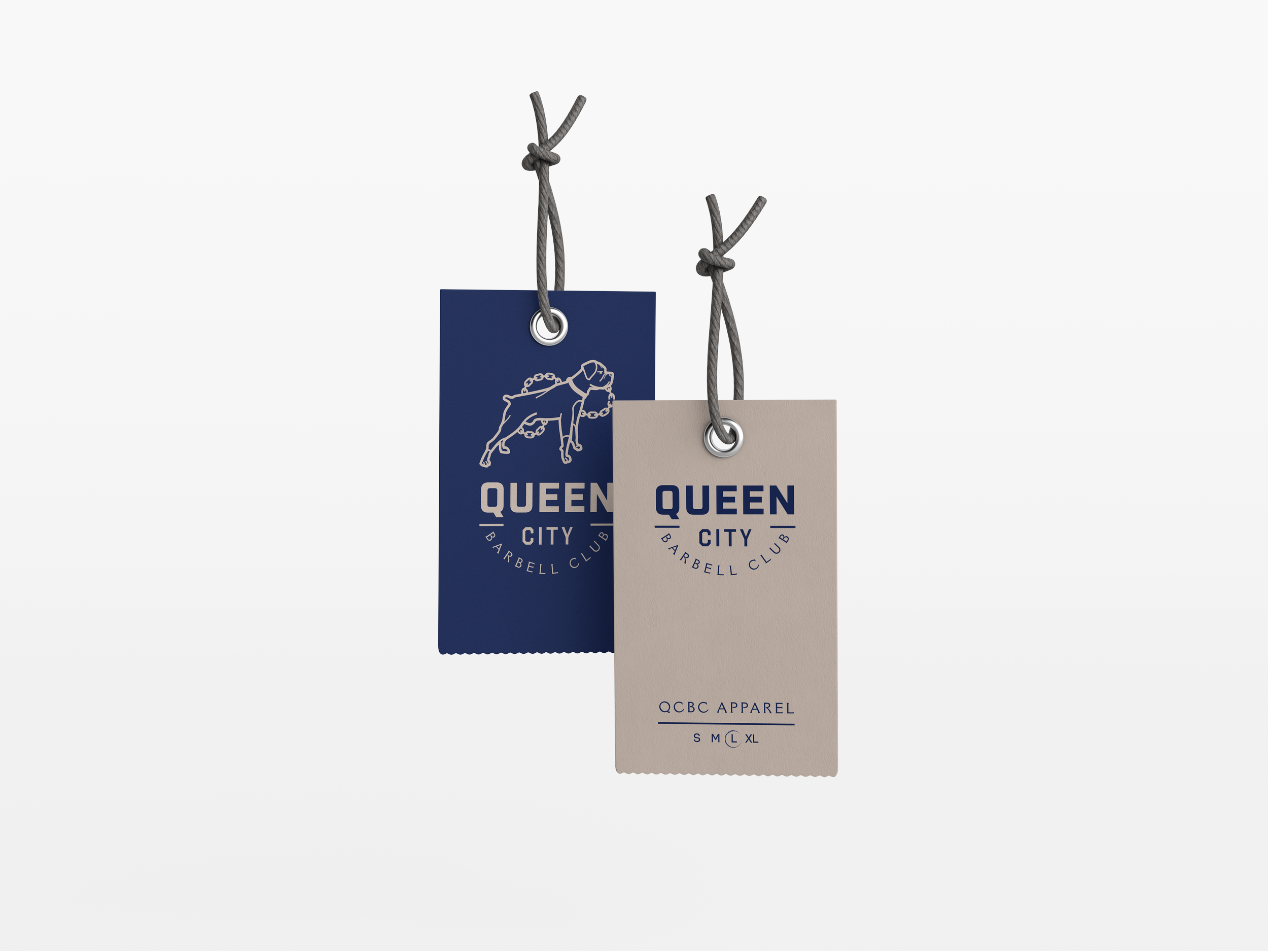
Queen City Barbell Club was started by a young entrepreneur from Poughkeepsie, NY who is passionate about fitness, healthy living and his boxer; Bravo. He briefed me about the importance of his loyal friend for inspiration for them and their brand and so Bravo became the focal point of the branding system. I created a logo mark and iconography that would easily work on the various apparel products QCBC would be carrying.
Client: QCBC
Role: Art director, Graphic designer, Illustrator


